Crafting effective CTAs (Call-to-Actions) is essential for financial advisors to turn website visitors into clients. The best CTAs are clear, focused on immediate benefits, and strategically placed. Here’s what works:
- Clarity: Use direct, action-oriented language like "Schedule Your Free Consultation."
- Value: Highlight benefits, e.g., "Get a Personalized Retirement Plan."
- Placement: Place CTAs in high-traffic areas like the homepage or service pages.
- Design: Use contrasting colors and clean layouts to make CTAs stand out.
- Urgency: Create urgency with limited-time offers like "Free Consultation Ends Soon."
- Personalization: Tailor CTAs to specific audiences, such as retirees or young professionals.
Examples include "Book Your Free Meeting", "Download Our Financial Guide", or "Join Our Free Webinar." Testing and refining CTAs can further improve engagement and lead generation.
| CTA Type | Example | Best Placement |
|---|---|---|
| Free Consultation | "Book a 15-minute Goal-Setting Session" | Homepage, Service Pages |
| Newsletter Signup | "Get Weekly Market Insights" | Blog, Footer |
| Event Registration | "Join Our Free Webinar on Retirement" | Homepage Banner |
| Resource Download | "Access Our 2025 Financial Guide" | Resource Pages |
Start with clear, benefit-driven CTAs to guide potential clients toward action and grow your financial advisory practice.
Financial Advisor Gets 16 Appointments from 1 Call to Action
How to Create Effective CTAs
Creating CTAs that drive action for your financial advisory practice requires a thoughtful approach. These strategies will help you guide potential clients toward taking the next step.
Design for Visibility
Your CTA needs to stand out. For example, Sustainable Wealth Management uses buttons that contrast sharply with their website's background. Their "See What We Can Do For You" button is hard to miss and grabs visitor attention instantly [3].
Use Action-Oriented Language
Be specific and direct. Instead of generic phrases like "Learn More", opt for something like "Schedule a 15-minute financial goal-setting call." This approach makes it clear what action the visitor should take [2].
Here’s a simple way to structure your CTA for clarity and impact:
| Component | Description | Example |
|---|---|---|
| Client Concern and Benefit | Address specific needs and offer immediate value | Uncertain about retirement? Get your personalized roadmap |
| Action Step | Provide a clear and easy next move | Book your free call now |
Strategic Placement
Where you place your CTA matters. Great River Financial does this well by including CTAs in key areas of their site, such as options to schedule calls or download questionnaires. This ensures that visitors always have an easy way to engage [3].
Focus on Urgency
Motivate visitors to act quickly by creating a sense of urgency. For example, offering a limited-time free financial health check can push potential clients to take action sooner rather than later [2].
Make It Personal
Tailor your CTAs to resonate with specific client groups, like young professionals or retirees. This approach makes your offer more relevant and increases the likelihood of conversions [2].
These principles are already being put to use by financial advisors to create CTAs that truly connect with their audience. Let’s take a closer look at how these strategies perform in practice.
1. Great River Financial's CTAs for Different Client Groups
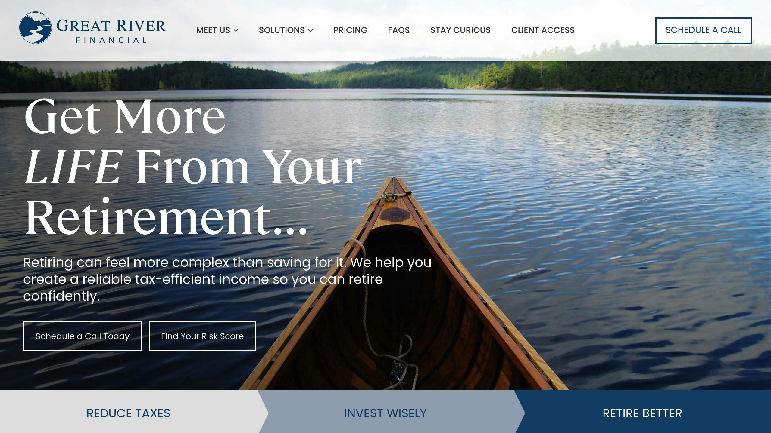
Great River Financial uses straightforward, action-driven CTAs like "Start Here" and "Schedule a Call", placed prominently in the hero section and as a persistent button for easy access. These clear prompts make it simple for visitors to take the next step [3].
Their approach offers several ways for clients to engage, catering to different preferences:
| Engagement Option | Description |
|---|---|
| Schedule Introduction Call | Ideal for clients ready to connect right away. |
| Download Questionnaire | Perfect for those who prefer a private, self-paced start. |
| "Start Here" Journey | Designed for new visitors exploring available services. |
This setup allows clients to choose the option that best fits their needs, recognizing that everyone approaches financial planning differently [3].
For financial advisors, this strategy creates a natural, step-by-step process to build trust with prospects. By guiding visitors from initial interest to action, the CTAs make financial services feel approachable while maintaining a professional tone.
Great River Financial's approach serves as a strong model for engaging diverse audiences. It also aligns with techniques used by other firms, like Sustainable Wealth Management, which we'll discuss next [3].
2. Sustainable Wealth Management's Problem-Solution CTAs
Sustainable Wealth Management simplifies decision-making with clear, problem-solution CTAs. Unlike Great River Financial's broader engagement options, their homepage focuses on approachable and professional messaging with phrases like "See What We Can Do For You" and "Start Yours" [3].
Strategic Placement and Design
The firm ensures CTAs are hard to miss by carefully choosing their placement and design:
| CTA Location | Purpose |
|---|---|
| Hero Section | Grabs attention with a calming background. |
| Process Page | Encourages action with "Start Yours". |
| Static Button | Easy access to schedule via Calendly. |
The calming visuals make the CTAs stand out while keeping a polished look. Phrases such as "It All Starts With a Conversation" are crafted to feel inviting yet credible [3].
Effectiveness in Driving Conversions
These CTAs tackle client concerns head-on, guiding users naturally from identifying a problem to finding a solution. By combining strategic placement with a conversational tone, the firm lowers barriers that might prevent potential clients from reaching out.
The ever-present Calendly button makes scheduling a free 30-minute consultation effortless, while the problem-solution approach ensures prospects feel supported throughout their decision-making journey [3].
3. Sage Financial Advisors' Simple Navigation CTAs
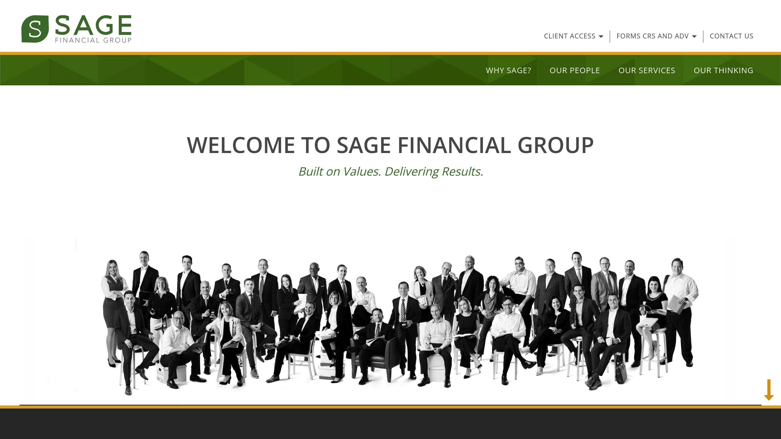
Sage Financial Advisors shows how keeping things straightforward and clear can help turn visitors into clients, building on the approach used by Sustainable Wealth Management.
Clear Messaging That Connects
With CTAs like "Create A Better Wealth Plan", Sage Financial Advisors keeps their messaging simple and to the point. This phrase highlights the benefit of their personalized financial planning services without overwhelming visitors with complex terminology. The result? Accessibility paired with a professional tone that resonates with their audience [3].
Smart Placement and Design Choices
Sage Financial Advisors places their CTAs thoughtfully across their site to guide users effectively:
| Location | Purpose and Design |
|---|---|
| Hero Section | Features "Create A Better Wealth Plan" prominently with a polished, professional look. |
| Process Page | Breaks down their service offerings with clear, actionable steps. |
| Static Corner | Keeps "Discover If We're A Fit" visible, making it easy for users to engage anytime. |
These placements ensure visitors can easily find what they need, creating a smooth and intuitive browsing experience. The professional design and messaging also help build trust along the way [3].
Driving Results with Targeted CTAs
One standout element is their "Discover If We're A Fit" CTA, which connects prospects to detailed team information. This ensures that leads are aligned with the firm's services. By tailoring each CTA to a specific stage of the visitor's journey, Sage Financial Advisors removes unnecessary obstacles, helping users take the next step while maintaining a steady flow of high-quality leads [3].
While Sage Financial Advisors focuses on clear navigation and personalized CTAs, other firms use similar strategies to promote educational events like seminars and webinars - more on that next.
sbb-itb-e3190ce
4. CTAs for Free Seminars or Webinars
CTAs for educational events like webinars or seminars often perform better than traditional contact forms. Why? They offer immediate value without requiring a long-term commitment. These types of CTAs are designed to move prospects from casual interest to active participation [2].
| CTA Type | Key Elements | Best Placement |
|---|---|---|
| Event Registration | Topic, time/date, limited seats, expertise focus | Homepage banners, landing pages, pop-ups |
| Educational Series | Course outline, expertise highlights | Resource sections, blog posts |
Using Clear, Action-Oriented Language
The best webinar CTAs directly address client concerns. Instead of generic phrases like "Register Now", they use action-driven language that emphasizes the benefit. For example:
"Join our free webinar to learn how to maximize your retirement savings" [2]
The word free lowers participation barriers, while "maximize your retirement savings" speaks directly to the audience's needs [3].
Placement and Design Tips
Strategic placement and design make a huge difference. Pairing CTAs with countdown timers on homepage banners or embedding them in resource sections next to related content can grab attention. Use contrasting colors and clean layouts to make the buttons stand out [2][3].
To increase sign-ups, add social proof. Testimonials from past attendees can improve registration rates by up to 25%. For instance, a line like, "See how past attendees improved their retirement strategies", adds credibility and demonstrates real benefits [2].
5. Newsletter Signup CTAs with Exclusive Offers
Newsletters are a great way for financial advisors to keep leads engaged and build lasting client relationships. Unlike CTAs aimed at quick actions, newsletter signups offer steady value over time. In fact, personalized CTAs can boost conversions by 202% [1].
| Offer Type | Value Proposition | Example CTA |
|---|---|---|
| Free Resources | Guides and in-depth insights | "Get Instant Access to '5 Steps to Retirement Readiness'" |
| Market Updates | Expert analysis and trends | "Join 5,000+ investors receiving actionable weekly market insights" |
| Premium Content | Exclusive strategies | "Get VIP Investment Insights Delivered Weekly" |
How to Make It Work
Here’s how Great River Financial nails their newsletter signup:
"Stay Informed with Our Weekly Market Update - Join 5,000+ Investors Getting Actionable Financial Insights"
Sage Financial Advisors also saw a jump in conversions by using smart tactics like:
- Placing forms in high-traffic spots
- Adding testimonials near signup forms
- Offering a sneak peek of what subscribers will get
- Providing instant rewards (e.g., "Get our 2025 Investment Guide when you subscribe")
To succeed, skip the generic language. Instead, make your CTAs stand out by emphasizing the unique benefits subscribers will gain. Pairing signups with immediate perks not only grabs attention but also keeps the audience engaged for the long haul.
While newsletters are perfect for nurturing long-term interest, CTAs like free consultations can drive quicker results. Let’s dive into that next.
6. Free Consultation CTAs Like 'Book Your Free Meeting'
Free consultation CTAs transform website visitors into leads by addressing financial concerns directly. Instead of generic "Contact Us" buttons, these CTAs target specific pain points, encouraging meaningful engagement.
| Example | Purpose |
|---|---|
| "15-minute financial goal setting" | Sets clear expectations and minimizes time commitment |
| "Get specific tax reduction recommendations" | Emphasizes immediate benefits |
| "Schedule Your Complimentary Strategy Session" | Encourages the next actionable step |
CTAs for free consultations are most effective when they use clear, benefit-driven language, like:
"Book a 15-minute call for personalized tax-saving strategies"
This type of messaging works because it combines three key elements:
- A defined time commitment
- A clear purpose
- A specific, actionable result
Placement and Design Tips
To maximize visibility, place these CTAs in high-traffic areas such as hero sections or service pages. Pairing them with related content, like blog posts or calculators, can boost relevance and engagement. Use eye-catching visuals while maintaining a professional look to make the booking buttons stand out.
7. Financial Advisor Marketing's Free List of 51 Tools

For financial advisors aiming to expand their practice, tackling issues like poor lead quality is crucial. Financial Advisor Marketing addresses this head-on with a compelling call-to-action (CTA) offering their free list of 51 tools. The main CTA button states: "Stop Paying for Recycled Leads - Get Your Free Tools List", directly appealing to advisors' frustrations while presenting a clear solution.
Why It Works for Conversions
This CTA thrives because it leads with value. Offering a free, practical resource lowers barriers for users, while the simple form - requiring minimal information - makes it easy to act quickly.
| CTA Element | Purpose | Impact |
|---|---|---|
| "Free List" Emphasis | Removes cost concerns | Encourages engagement |
| "51 Tools" Specificity | Highlights tangible benefits | Boosts credibility |
| "Essential" Qualifier | Adds urgency | Motivates immediate action |
Clear and Targeted Messaging
The CTA uses direct, action-oriented language to connect with financial advisors:
"Get your free list of 51 essential marketing tools specifically curated for financial advisors to help them grow their practice."
This phrasing works because it clearly defines the offer, focuses on the target audience, and stresses the benefit of practice growth.
Smart Placement and Design
The CTA is designed to stand out with high-contrast buttons, a clear hierarchy of benefits, and layouts optimized for mobile devices. It’s strategically positioned in the website's main navigation and on pages related to practice growth, making it easy to find and act on.
This example shows how offering targeted, useful resources can effectively boost engagement - a tactic that can enhance many CTA strategies.
Tips for Using CTAs Effectively
Crafting calls-to-action (CTAs) that work involves balancing clarity, relevance, and smart placement. Here’s how financial advisors can make their CTAs stand out and drive results.
Placement Is Key
Place CTAs where they naturally align with what your visitors are looking for. Think spots like above the fold on your homepage, within service pages, or at the end of blog posts. For example, Sustainable Wealth Management places "See What We Can Do For You" prominently on their service pages, making it easy for visitors to take the next step [3].
Design and Testing for Better Results
The way your CTA looks can make or break its performance. Use contrasting colors to grab attention, larger buttons for mobile users, and plenty of white space so it doesn’t get lost in clutter. Make sure your primary CTA stands out more than secondary ones to guide users effectively.
Track how your CTAs perform using analytics, and run A/B tests to tweak things like button text or placement. Don’t forget mobile optimization - smooth functionality is a must. Great River Financial, for instance, regularly tests the placement and wording of their "Start Here" button, which has led to better engagement rates [3].
Words That Drive Action
"The best CTAs are specific to a unique group, solve an urgent problem, and take less than one minute to complete." [2]
For financial advisors, the wording of your CTA matters. Skip vague phrases like "Learn More" and go for something more direct and appealing, like "Get Your Personalized Retirement Savings Plan Today" [2].
Focus on Immediate Benefits
Make the value clear in your CTA to encourage action. Highlight quick, tangible benefits to build trust and reduce hesitation. Phrases like "Book a Free Tax-Saving Strategy Session" are great examples of how to motivate users to take the next step.
Conclusion
Clear and well-placed CTAs can help financial advisors grow their practice by encouraging clients to take action. Using specific, action-oriented language tailored to client needs can significantly improve lead generation and engagement.
Firms like Great River Financial and Sustainable Wealth Management demonstrate how effective CTAs can deliver results by addressing client concerns directly and offering clear next steps.
The best CTAs are straightforward, focused on client value, and simple to complete. Whether you're inviting clients to book a free consultation, access exclusive financial resources, or join an educational webinar, your CTAs should align with their interests and make the process easy.
Testing and refining your CTAs is key to ongoing success. By doing so, financial advisors can create CTAs that not only bring in leads but also build trust and foster lasting client relationships.
CTAs are a vital part of any digital strategy, offering financial advisors a practical way to expand their practice and better meet client needs.